LIV Possibilities (Lear Innovation Ventures)
Brand Identity Design
CLIENT
Lear Automotive
ROLE
Design Lead
TIME FRAME
1 year +
OVERVIEW
Lear Automotive enlisted the branding expertise of Vectorform to help create the identity of Lear’s innovation pipeline. Vectorform was responsible for creating a scalable branding solution which included a band mark, an identity guide, a brand position strategy, swag, digital/print collateral, and a microsite.
As design lead, I was tasked with overseeing the successful creation and launch of LIV Possibilities (Lear Innovation Ventures) brand identity, for internal and external use in the innovation consultancy offering of a global company.


CHALLENGE
Our objective was to create a brand platform that could help unite innovation themes, culture, communication, design, and strategy to translate business needs into one cohesive approach. Expressing the nature of innovation, and more importantly, the innovation pipeline at Lear, we want to help drive participation, quality, and leadership for collaborative efforts of the Lear Core Value of Innovation. Additionally, as the name implies, we see it as a mission to help fulfill the Lear brand mantra of "Where Passion Drives Possibilities.”
SOLUTION
We solved this challenge by not only creating a cohesive and expansive brand identity platform that covers many distinct methods of communication but also by envisioning a mechanism by which the innovation pipeline can usher in a new age of innovative exploration. Lear Innovation Ventures taps Lear's internal and external pursuits to drive growth and to embrace the critical inflection point of our technological times. Our call to action is simple: You are either exploring for opportunity or executing new value.
Identity Design
Our first step was creating a lasting and memorable identity mark that can speak to the innovative and progressive nature of the work being done in Lear's innovation pipeline. 3 main versions of the logo were created, each with a unique and specific purpose.
PRIMARY LOCKUP
This wordmark, comprised of the Lear icon & LIV Possibilities logo, is the primary identifier. When this lockup is used, it should always be accompanied by the independent title “LEAR INNOVATION VENTURES”.
SECONDARY LOCKUP
This wordmark, comprised of the LIV Possibilities logo and the title “LEAR INNOVATION VENTURES”, is the secondary identifier. This lockup works well for posters or other collateral featuring photography.
CORPORATE LOCKUP
This lockup, comprised of the Lear wordmark, LIV Possibilities logo and the title “LEAR INNOVATION VENTURES”, is our corporate identifier. This lockup should only be used in corporate material.

INDEPENDENT TITLE
The independent title “LEAR INNOVATION VENTURES” must always be paired with the primary lockup. Its wide tracking and placement within the composition ensures legibility and ease of understanding. When used, it should precede the logo so the title is prominent and read first.
Logo Exploration
Over 100 logo concepts were created and presented to the client as the brand was still being actively defined. Early versions of the name included LIFT (Lear Innovating Future Technologies), RISE (Research Innovation Science & Endeavors), LAB (Lear Advancement Bureau), and many more. Ultimately the client settled on LIV Possibilities.

Discover and Deliver
Discover and Deliver are implemented in the LIV design system, serving as rhetorical elements that express the nature of innovation. These core tenets are repeated in the visual language across the brand representing focus on our actions with distinct mindsets, methods, and measurements.


DISCOVER
The visual elements that represent Discover are designed to subliminally enforce the concept of discovering opportunity. The circular iconography and glyph evoke a sense of the human touch and the iterative process that come from searching and experimenting.
DELIVER
The visual elements that represent Deliver are designed to subliminally enforce the concept of delivering value. The squared iconography and glyph evoke a sense of precision, control and finalization, that come from deployment and delivery.
Slash
The slash is a fundamental element in the LIV brand system. The 35° angular form of the slash within the “V” evokes a forward sense of direction, movement, and elevation. The slash may be used independently as a mechanism to emphasize the brand. For example, the slash can also be used as a mask for imagery or the focus of a composition.

Posters
Posters were designed to capture the essence of the innovative process. A handful of these were chosen for large scale deployment.


Brand Guide
An extensive stylistic and branding guideline document was created. It meticulously detailed brand strategy, logo, brand precepts, colors, typography, and print collateral.


Clothing
Clothing and other swag items were designed for internal use throughout the organization to promote the brand.
Projects
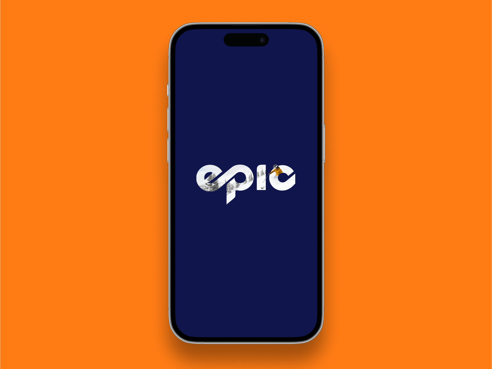
MyEpic AppUI /UX, App
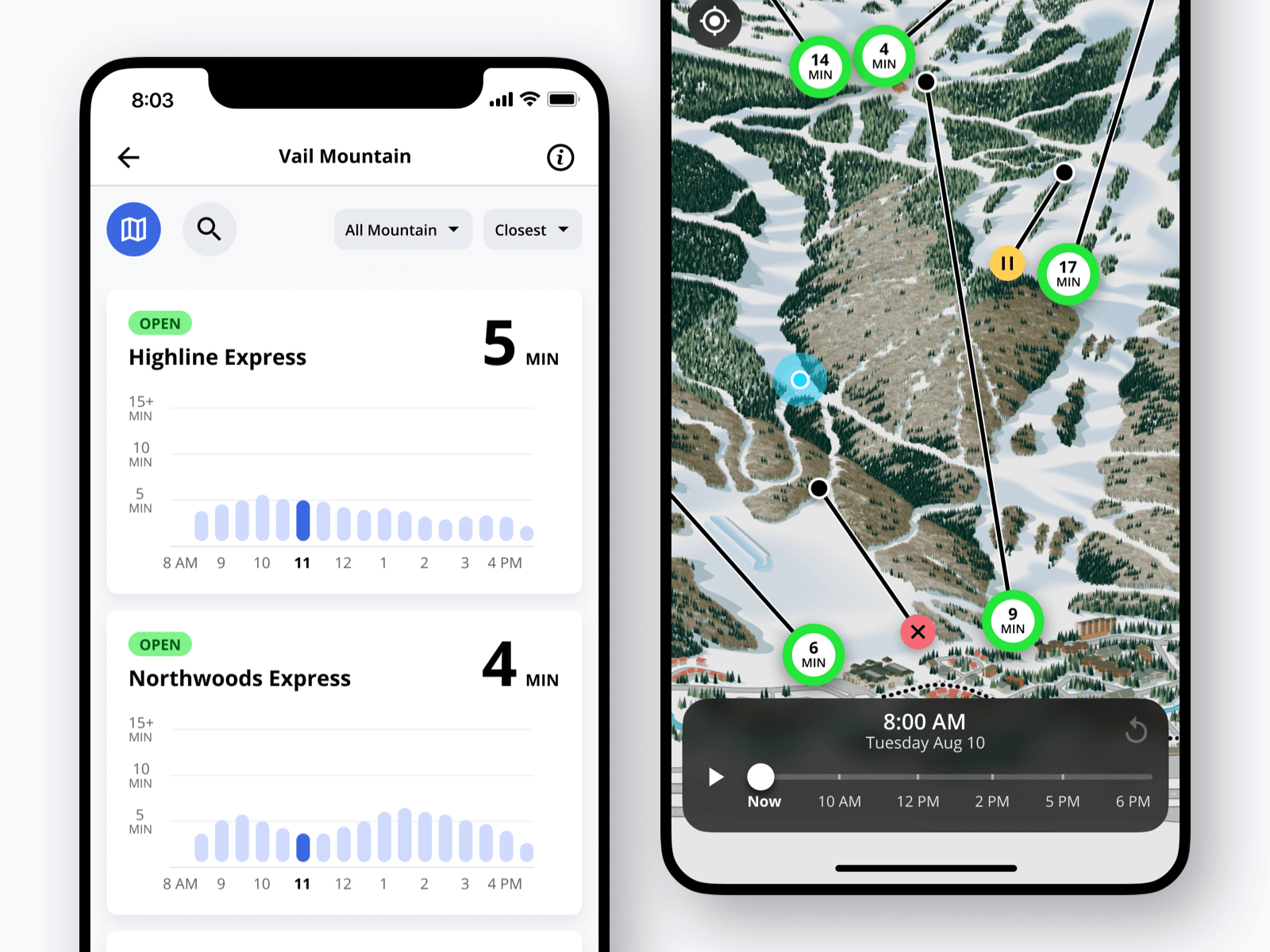
Lift Line Wait TimeUI / UX, App
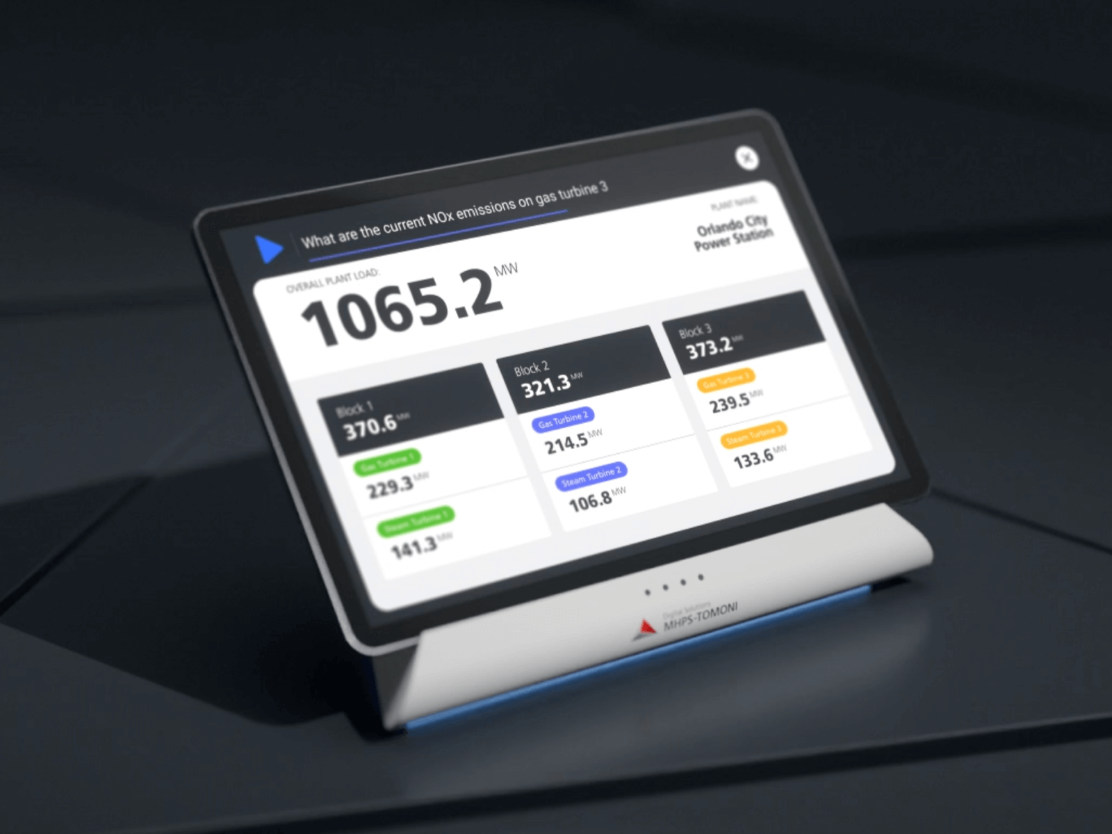
Smart Voice AssistantID, UI / UX
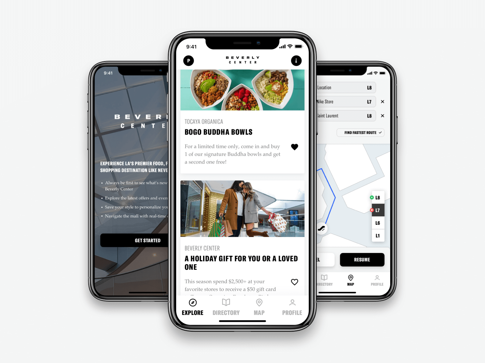
Taubman Shopping AppUI / UX, App
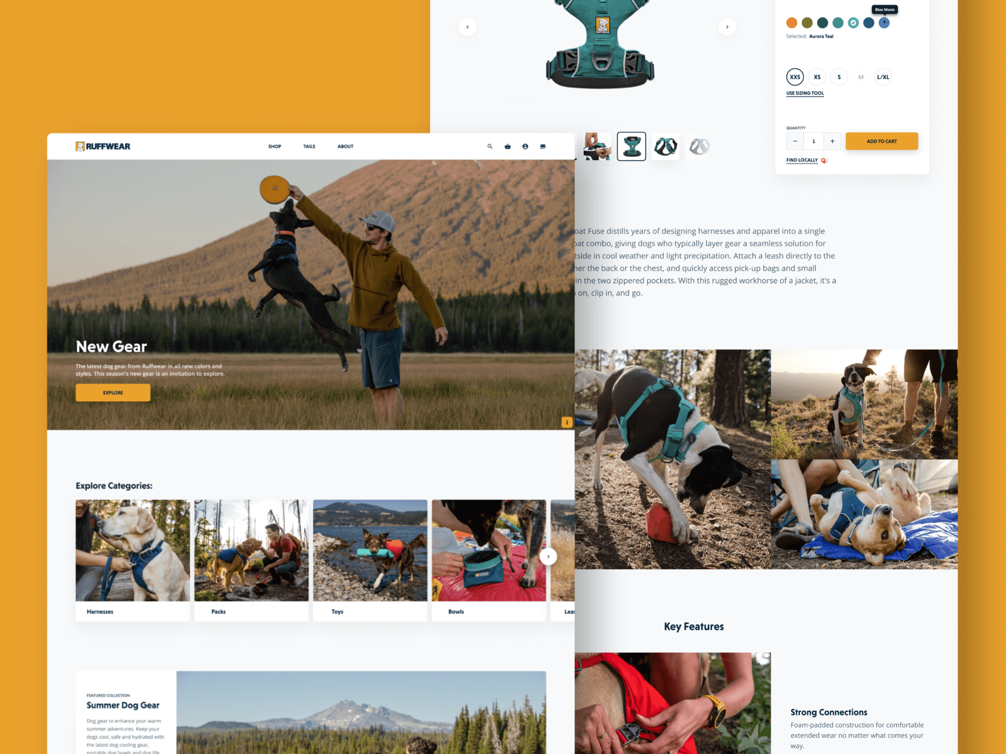
Ruffwear - Performance Dog GearUI / UX, Web
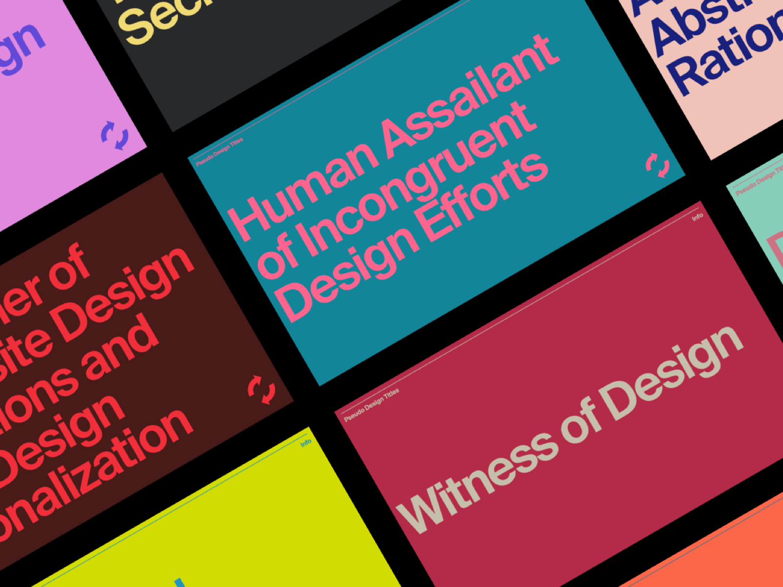
Pseudo Design TitlesUI / UX, Web
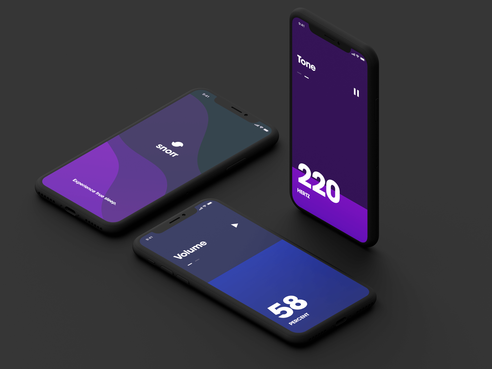
Snorr AppUI / UX, App
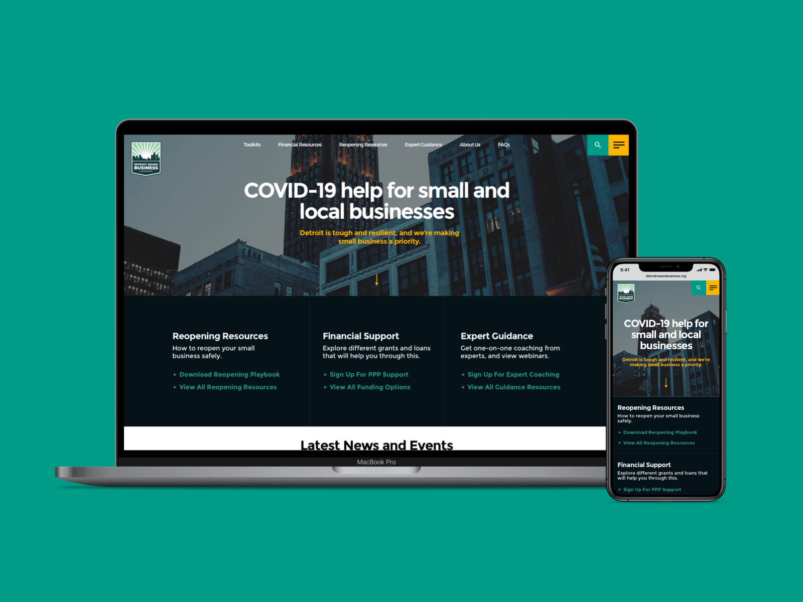
Detroit Means BusinessUI / UX, Web
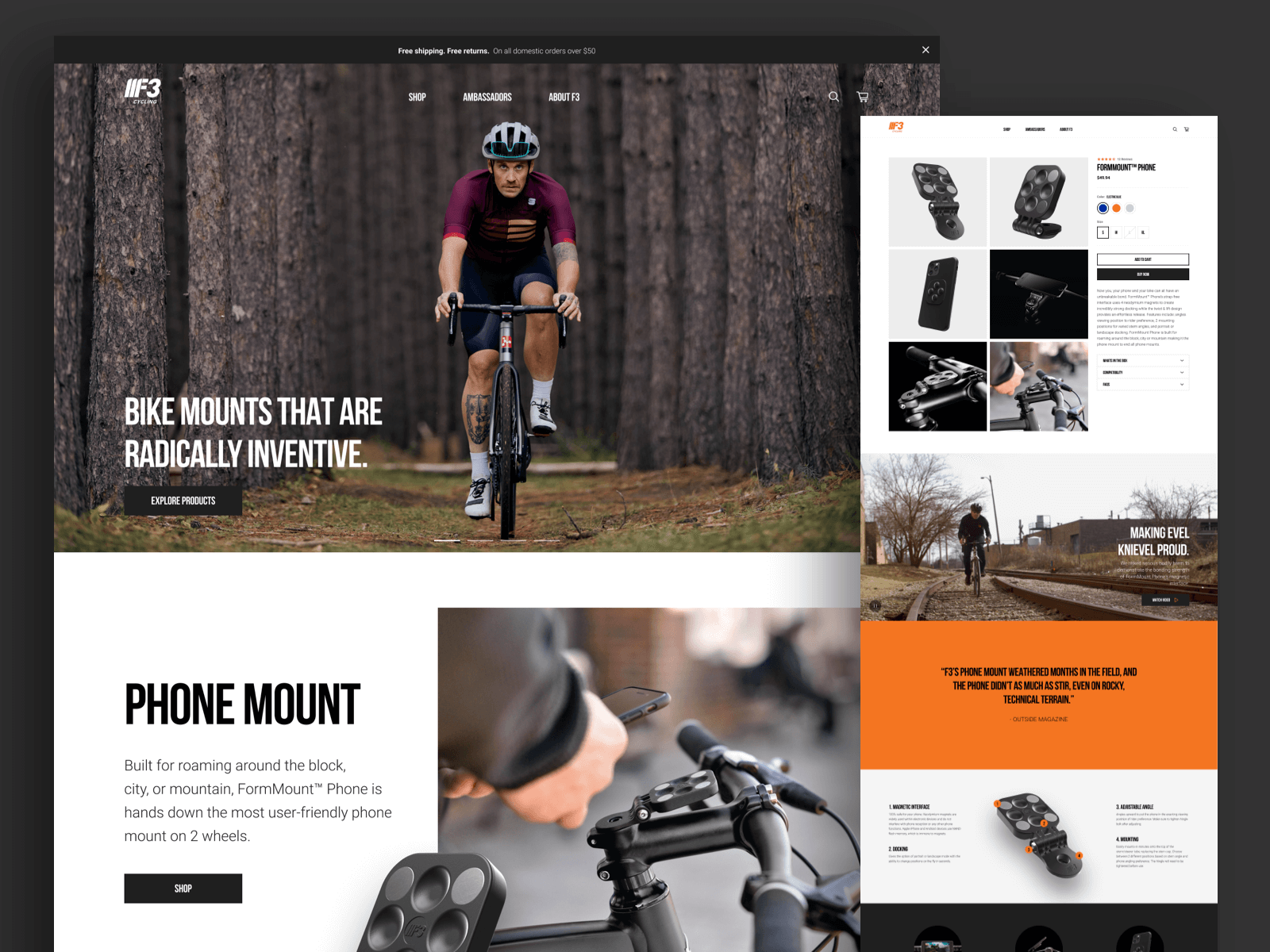
F3 CyclingUI / UX, Web
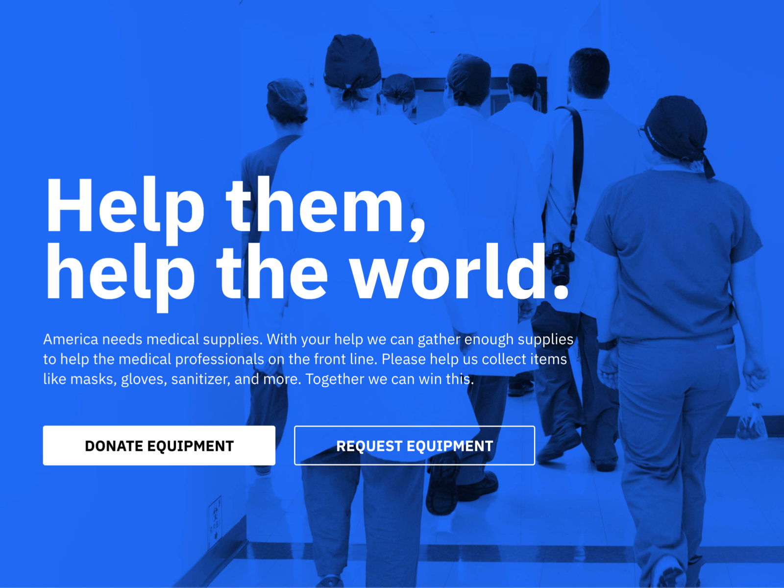
Covid HeroesUI / UX
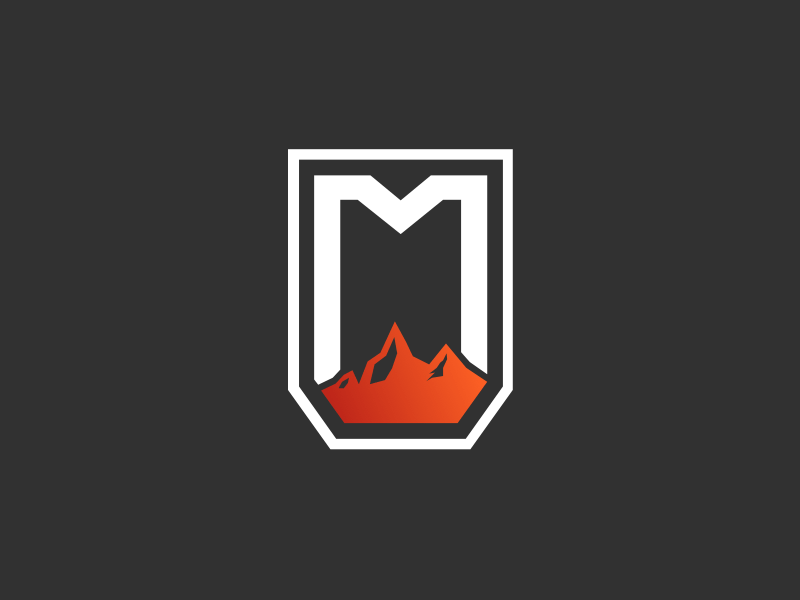
Marquette CastingsBranding
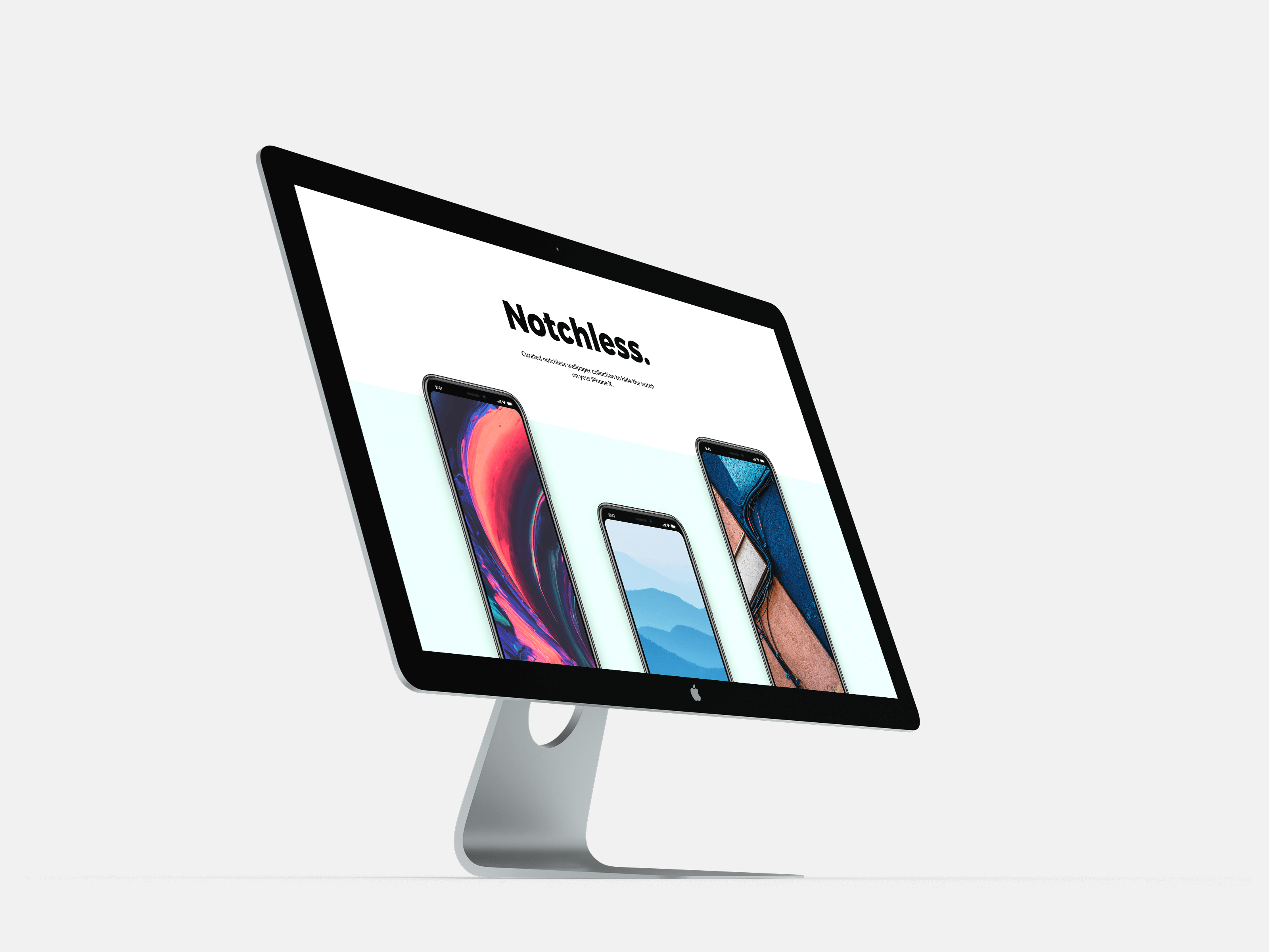
Notchless.spaceUI / UX, Web
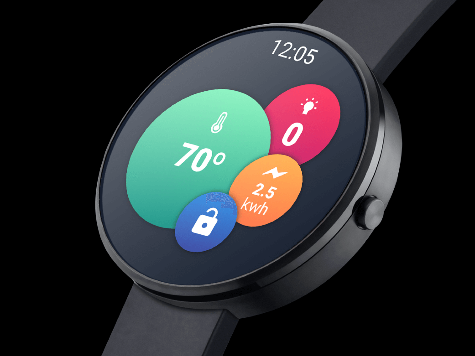
AndroidWear BubbleUI / UX

Marquette CastingsIndustrial Design
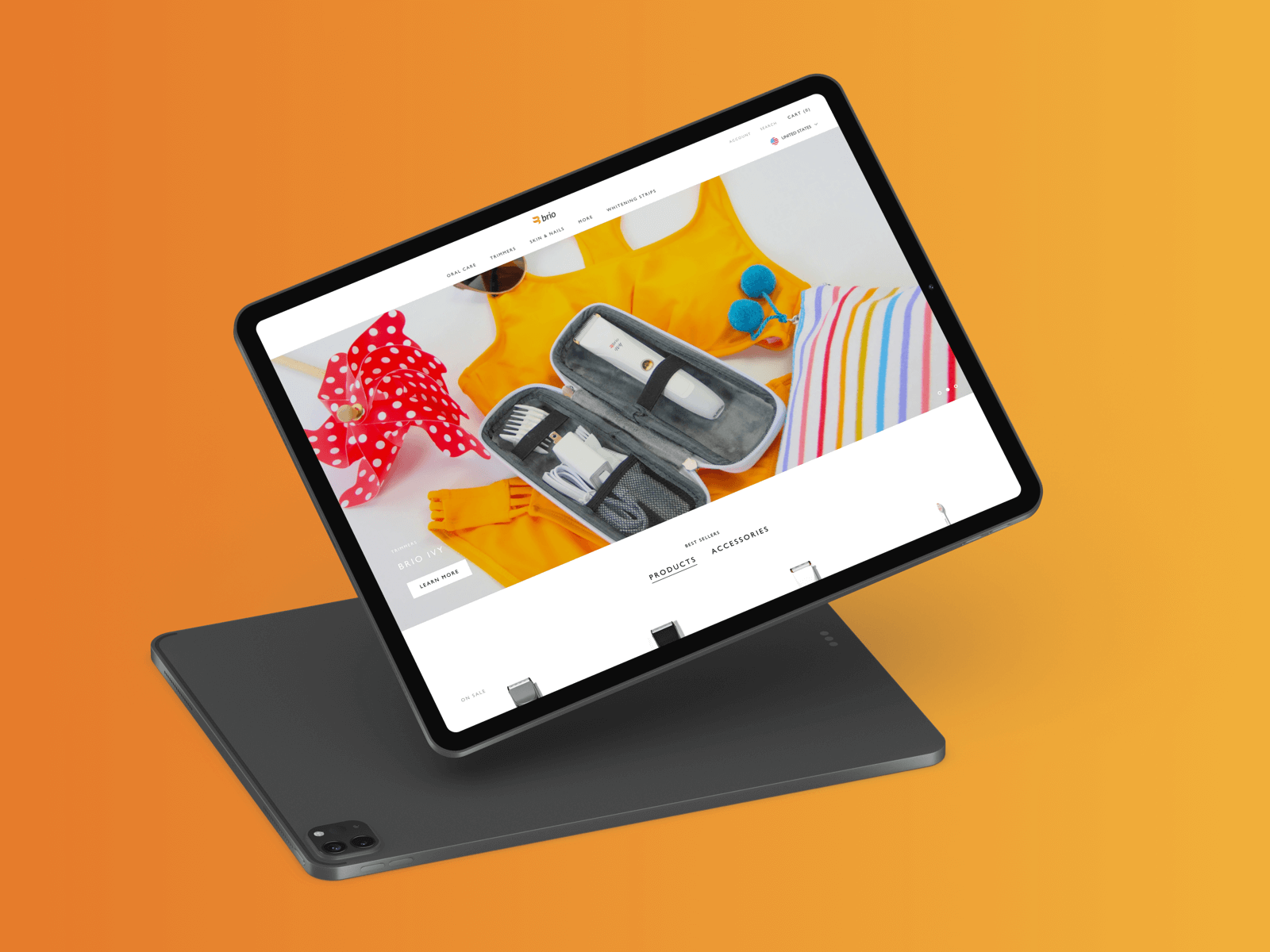
Brio Products GroupUI / UX, Web
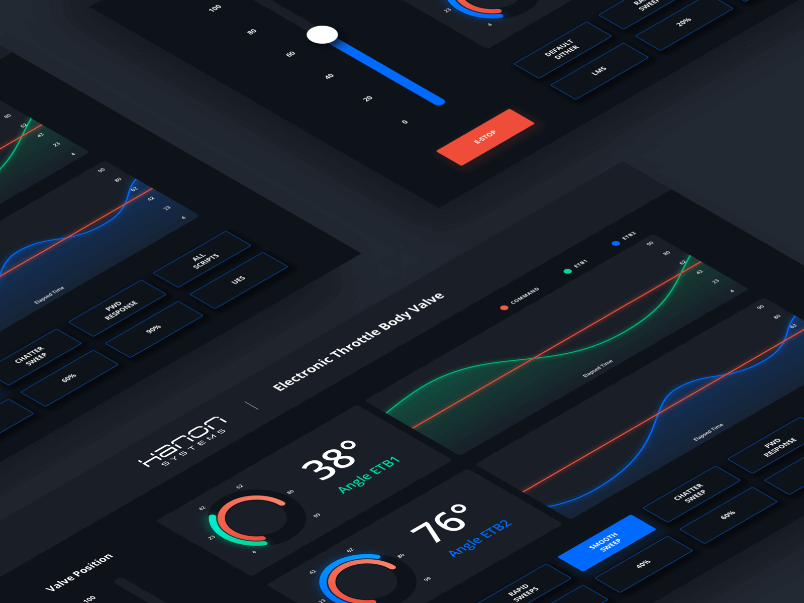
Hannon Systems DashboardUI / UX